A story of love and care

  • Brand Identity
  • Brand Strategy
  • Packaging
  • Illustration

The Challenge

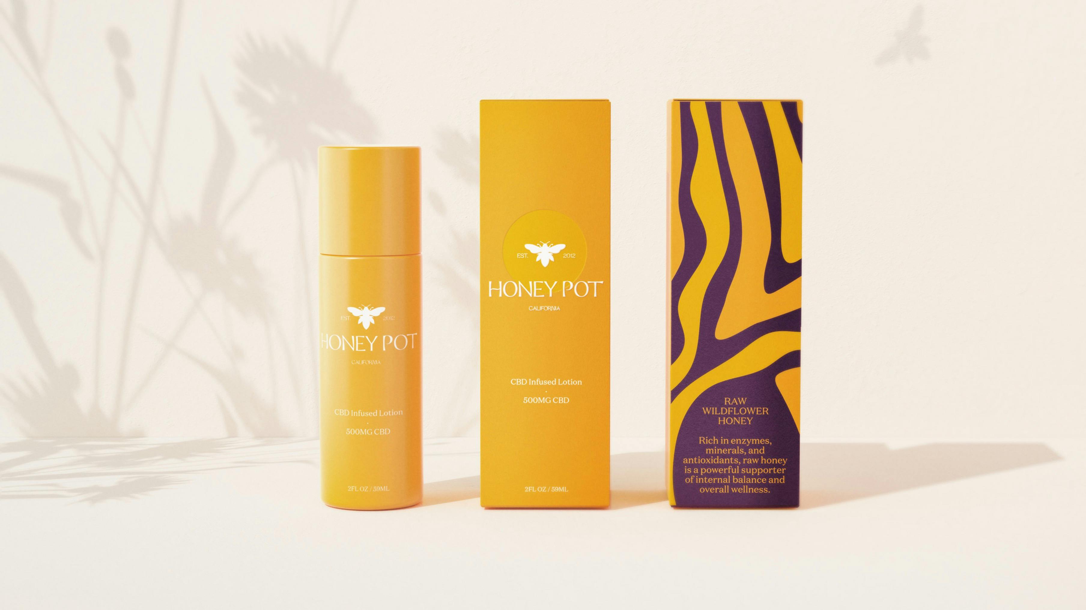
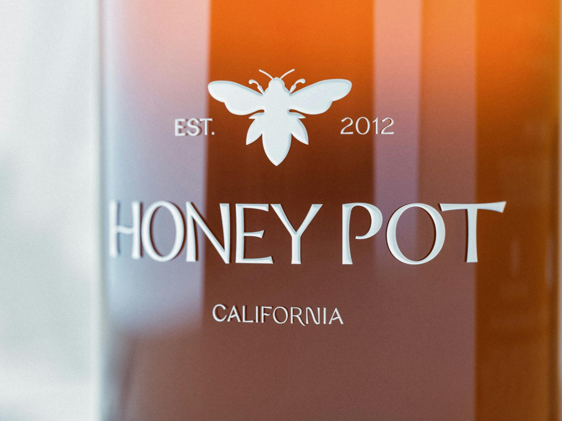
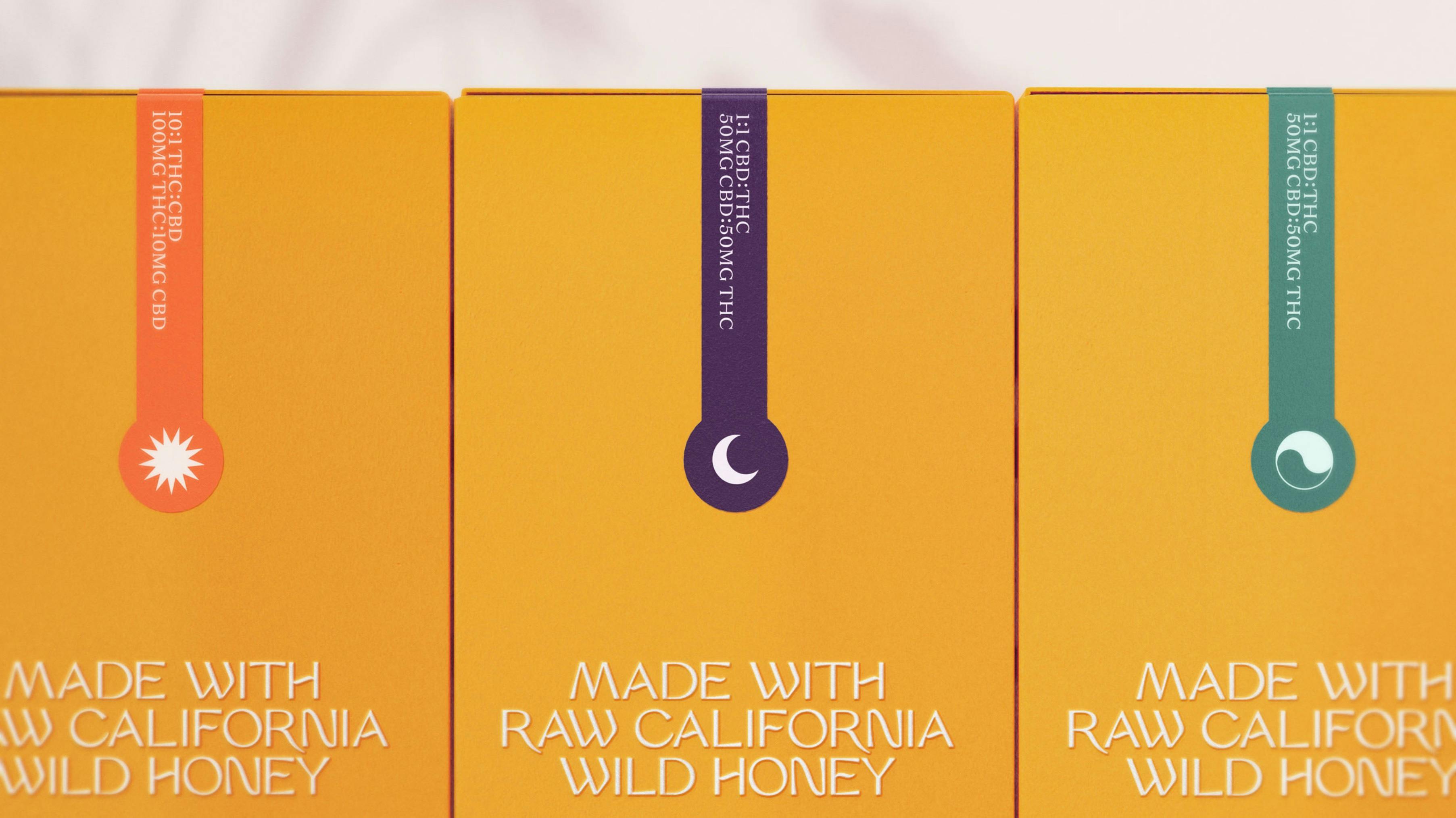
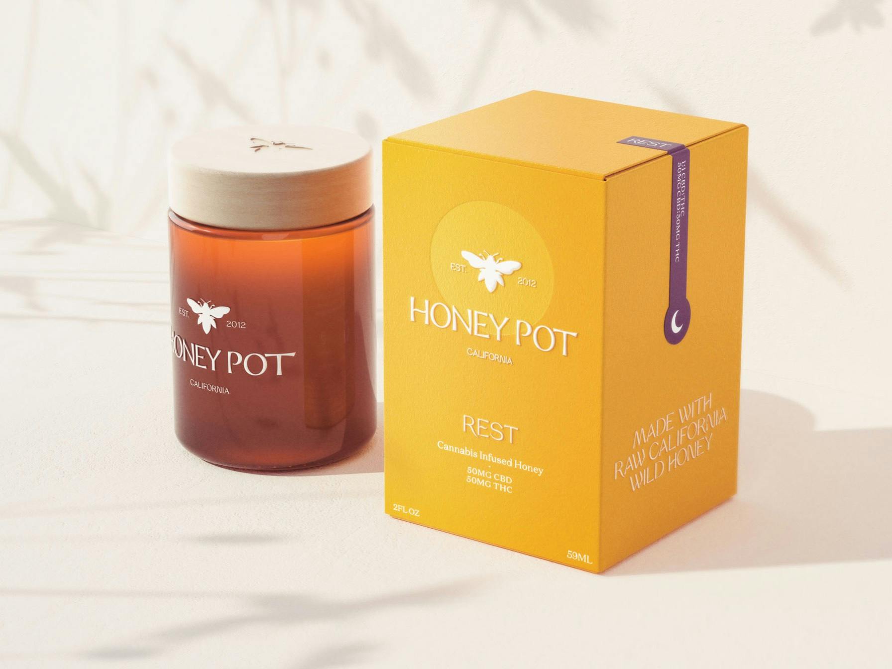
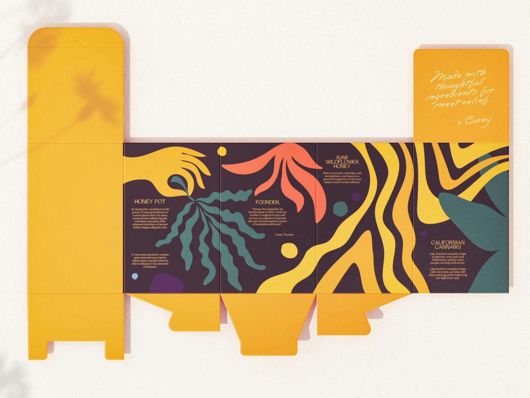
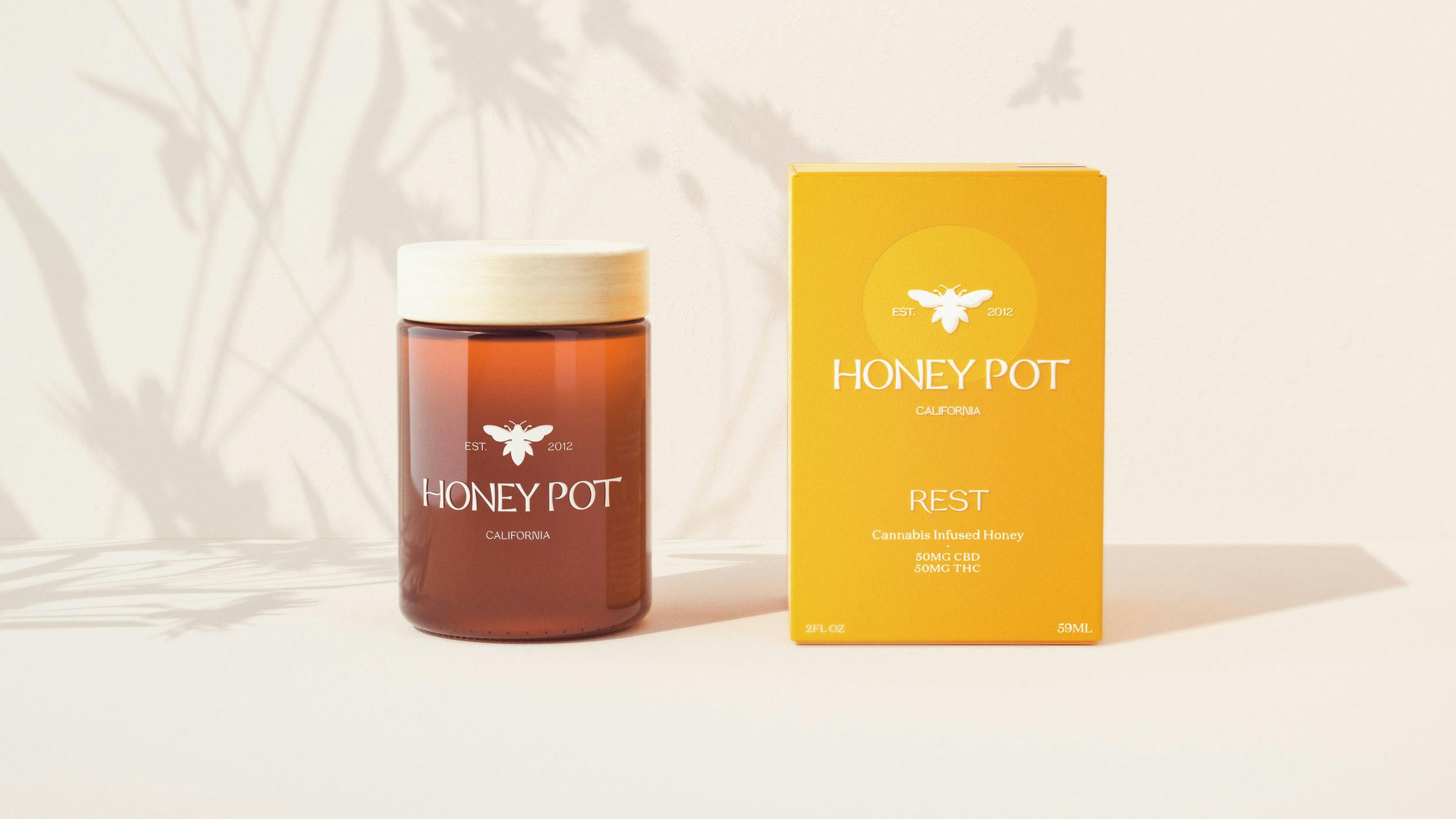
Back in 2012, founder Corey Thomas established Honey Pot as the first female founded cannabis brand in California, rooted in female care. The brand was created in response to a close friends struggling vocal chords, Corey took her mothers recipe for canna-honey, and cooked up what is still the brands recipe today. In seeing an opportunity to create products that had the power to help people, Corey set out on a mission to bring joy, education and care to California, then the world. Seven years and eight High Times awards later, Honey Pot has grown to become a complete wellness care brand, offering a wide range of products, all made with thoughtful ingredients for sweet relief.

The Approach

Despite all the great work Corey and her team had done in creating the brand. The story was not being told in a compelling way with competitors were stealing share using a stronger narrative and a deeper understanding of the consumer.

In response, we reached back into the brands story and drew inspiration from Corey’s vision for the brand and it’s mission to empower women through cannabis derived personal care. From this we arrived at the importance of Sisterhood as a central thread to the brand. The brands California provenance was also key in differentiating it, as well as it’s product truth in using California wild flower honey as it’s primary ingredient.

The result was a new identity that captured the distinctive beauty and mood of California, whilst allowing the brand to leverage it’s provenance, the brands product truths, all whilst communicating the brand and product proposition more clearly.

We created a marque that subtly told the story of cannabis and honey, whilst feeling crafted and elegant. The word marque was inspired by the beautiful tension in Corey’s strength and softness, with a modern dynamic styling and subtle elements that takes you to the idea of honey’s sensual nature.

We hand drew a series of illustrations to further tell the brand and product story, drawing inspiration from Matisse style cutouts with a contemporary twist. These appeared on the inside of the packaging boxes as well as becoming the primary illustration style for the brand across all communications.

The Outcome

Honey Pot is now repositioned to launch back into the California market, as well as scaling across US as a hemp based cannabinoid wellness brand. With their new identity and suite of communication assets, the brand is in the the best possible possible position to capture the hearts and minds of consumers across the US and beyond.

Emboldened by the brands new perspective, Corey and her team are ready to take on the challenge of reaching a national, then global audience.

Good luck Corey, we will be by your side helping you to tell your incredible story of striving to improve lives.

We Are
A
Studio